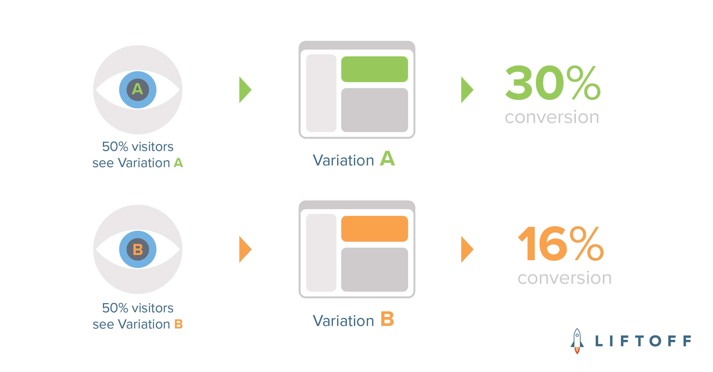
One of Liftoff’s strengths lies with our ad creative team who tirelessly A/B test and optimize ad creatives – all sizes and formats – to improve performance of our mobile app install campaigns. Whether it’s a simple copy or CTA test, testing artwork or new ad formats, the team has amassed countless performance gains for all of our clients.
Testing at Liftoff, however, goes beyond ad creative tests. A/B testing is also a part of the culture on the marketing team at Liftoff, demonstrating time and time again that gut instincts are often wrong. “I don’t know, let’s test it,” is a common phrase around here.
Email Marketing 101
With all performance marketing, there are basic metrics used to measure the results of A/B tests. In the case of email marketing, these metrics typically include:
- Open rate – The percent of emails opened out of your delivered emails.
- Click rate – The percent of emails clicked out of your delivered emails.
- Click-through rate – The percent of emails clicked out of those who opened the email.
- Unsubscribe rate – The percentage of contacts who unsubscribed (opted out) from a particular email.
Having a basic grasp of these terms helps understand what tests are successful (or not), and for what reasons.
Seasonal Email Imagery Test
In recent months, we’ve included visually appealing email banners on all Mobile Heroes emails which are sent every two weeks. As we entered the fall, we decided to match the email banner imagery to the current season and holidays including Halloween, Thanksgiving, Black Friday and Winter.
For the Thanksgiving email, we decided to test two different images: one image with a Thanksgiving theme (American-centric, tisk tisk, we know) and the other focused on Shopping. Given that the email is distributed globally, we were uncertain of which email would perform best. Here are the images used in the email banner test:
 Image Variation A: Turkey
 Image Variation B: Sales Tags
With the different email banners being the only single variable, we split our email list in half, sent the email, and waited a few days to look at performance results.
Seasonal Email Imagery Test Results

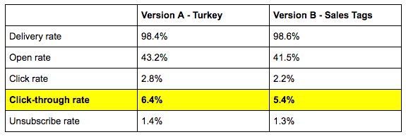
Looking at the single most important metric, click-through rate, we see that version A – the Thanksgiving theme – performed best. In fact, it performed 18.5% better than version B.
In addition, we looked at the % of people who clicked directly on the email banner and found that Version A was clicked by 4.3% of those who opened the email while only 2.3% of those who opened version B clicked the banner.
Conclusion: the turkey image—Version A—was more appealing to readers which earned a higher click-through rate.
Does this mean we will incorporate holiday banners on each email send? Our gut tells us “no,” but let’s test it!
—
Win a free Liftoff shirt by telling us what email tests you think we should run. Simply fill out this one question and you’ll be placed in a drawing to win a free shirt!
