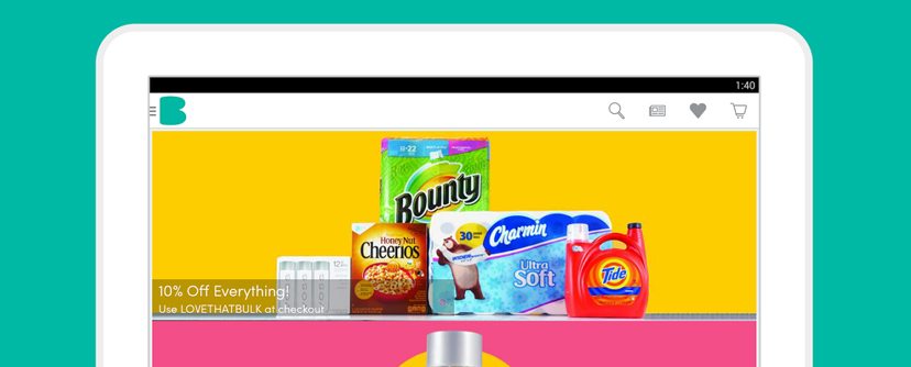
Every day, consumers are turning to their mobile devices to do their shopping. In 2015, shoppers spent nearly $75 billion shopping on their phones, up from $56.6 billion in 2014. For retailers and eCommerce companies, this shift in buying habits opens up new opportunities to grow revenues.
At Boxed, our focus is on acquiring new shoppers who will install our app, browse our products and make a purchase. In order to continually improve our UA campaigns and acquire more shoppers, we regularly A/B test our ad creative to learn what works best.
Here are my top 3 tips for designing high performing mobile ads to acquire smartphone users who spend.
Embrace Brevity
The best performing ad creative uses short, concise copy that clearly the defines the benefit of what you sell. I have also found that focusing on one unique selling point per ad improves post-install engagement. Even if your product or service has several compelling selling points, it’s too distracting to list them all in a small ad.
At Boxed, we have numerous selling points, such as “buying in bulk,” “saving money,” and “no hassle shipping right to your door,” among others. But instead of trying to work all three of those messages into a single ad, we try to focus on one or two selling points per ad, compare results, and iterate accordingly.
It’s smart to continually test the messaging in your mobile ads, but remember that keeping the message clear and concise is critical to a strong performance.
Use Simple, yet Powerful Images
Clearly displaying your product or service in a simple, easy to understand image is the most effective way to help users understand what you provide. Whether you use a screenshot of your app or a photo of a product, a simple image that illustrates the benefits of purchasing that product will drive more sales.
On a mobile device screen, this isn’t always easy because space is limited. At Boxed, we previously struggled to showcase the fact that we sell products in bulk because of how difficult it is to use images of bulk products on such a small screen. One way we overcome the small screen size is by focusing on images that demonstrate how Boxed shoppers feel when shopping with us, rather than using space-consuming images of bulk products without any context.
Show Off Your Brand
Use your brand as a marketing tool. Consistently using branding in your ads helps you build recognition, and if you catch a new user with an ad impression when they are ready to shop, they are more likely to click, given that the user recognizes the brand and has a sense of familiarity with the product or service.
In marketing the Boxed app, I find it extremely powerful to use our brand in comparison with the competition. We often run ads with images of what Boxed has to offer consumers, complete with the logo and brand colors, compared to what “the other guys” bring to the table. These ads make it absolutely clear that the Boxed experience is superior to that of our competition and perform really well for us.
Consumers are shopping on mobile devices more than ever before, a trend that shows no signs of slowing down in 2016. Keep the tips above in mind when designing ad creative and you’re sure to see an increase in mobile shoppers using your app.
